Graham's Favourite Font
Designer Graham Thew is the man behind some of our most gorgeous books, including Catherine Fulvio’s elegant Eat Like an Italian. As we continue our week celebrating our favourite things in honour of the Book Awards, he tells us about his favourite font – and why it’s so important.
1. What’s your favourite font?
Like asking your favourite movie or album, it all depends when you ask...at the moment I am admittedly on a Knockout by Hoefler & Fere-Jones binge.
2. What is it about Knockout that appeals to you?
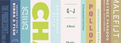
A modernist take on the Gothic woodtypes of a century ago, Knockout comes in 9 widths giving it plenty of scope for any number of uses. From shouting headlines to delicate reference, it’s apparent simplicity belies a wonderful elegance, a trademark of this Type Foundry’s exemplary fonts.
3. What sort of projects do you like to use it in?
It’s particularly suited to high impact designs like posters and book covers. It works really well when there’s a lot of information to impart quickly and sits beautifully with serifed slab fonts.
4. How important are fonts to you as a designer?
They are essential. Designing with a lack of empathy for fonts would be like trying to cook a souffle without eggs - you’d end up with something flat and tasteless.
We're Hiring - Gill Production Assistant
© 2025 M.H. Gill & Co. Unlimited Company